
“Katie’s created THE most beautiful sales funnel and sales letter I’ve ever seen…
Katie has gone above and beyond all of my expectations. Not only has she named the witty ‘A Butter Way’ program, she’s also created THE most beautiful sales funnel and sales letter I’ve ever seen. It has to be experienced to be believed!”
— Tara Hanrahan, SculptCoach
London, UK
Name & Logo
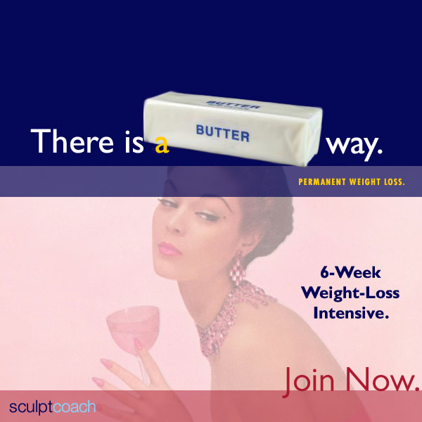
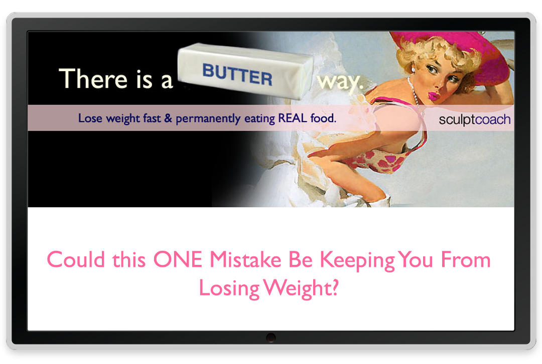
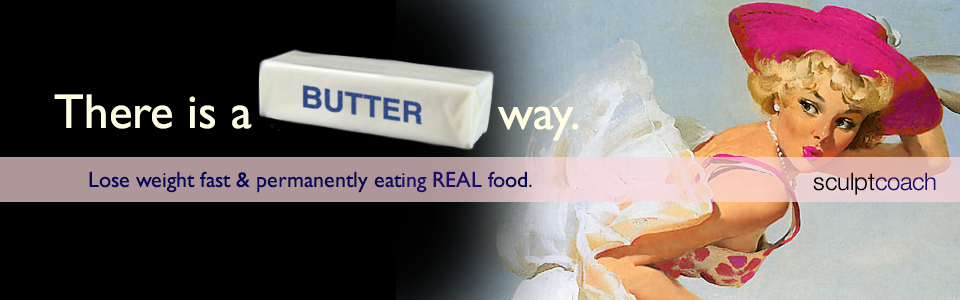
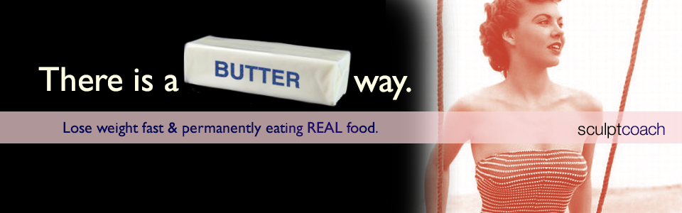
As soon as my client told me she advocated eating butter to lose weight, I was wildly inspired to create this Program’s name and identity. Our favorite was the winner, “A Butter Way.” Yum.
Tagline
The tagline is a simple addition to the Program name, adding the phrase “There is…” Keeping a tagline short is important for memorability and so you can make it show up large in advertising and posting.
Color Palette

I wanted the palette for A Butter Way to feel lush, like velvet. I used a rich black and a rich, warm navy along with a few shades of pink that conjure up lipstick colors. I leaned towards pinks over reds in the artwork too.
Typography
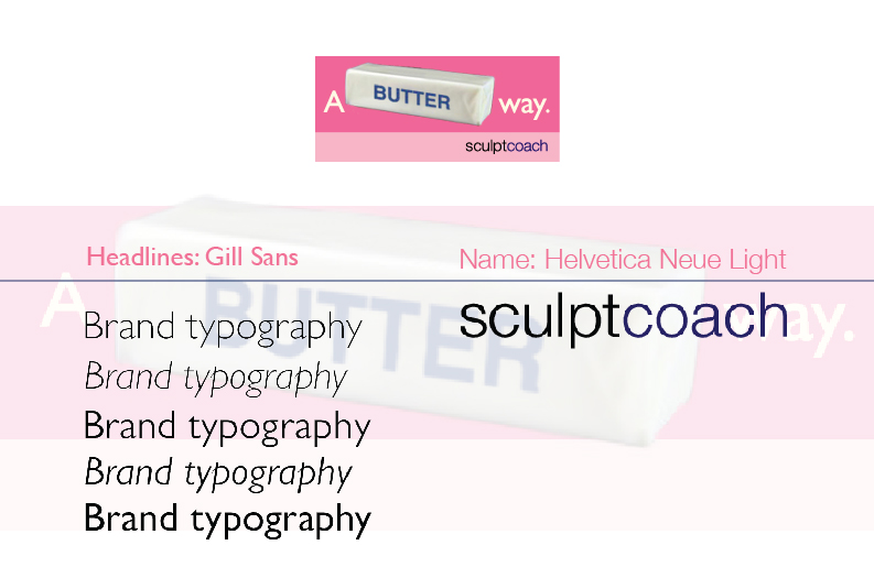
Display type for this project is Gill Sans, often used in advertising going back to the 1920s when Eric Gill first drew it and continuing in popular use today. Clean, legible yet artful letterforms make it a great choice for promotional work and advertising. It contains many weights from thick to thin, allowing for versatile treatments. I also refined the parent company’s logotype with a simple treatment using Helvetica Neue. The parent company’s style was very spare and clean so this worked well and also worked well with the Butter Way type and other brand style elements.
Vision Statement
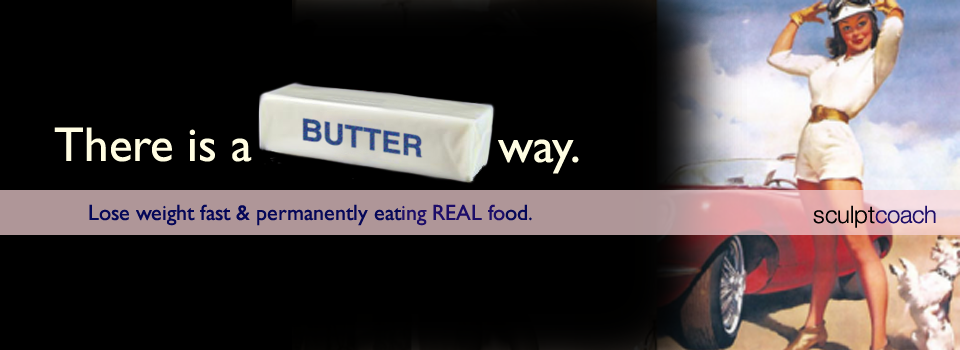
I was just beginning to do my Vision process when I worked on this great project. The statement helps people understand exactly what it’s about: “Lose weight fast and permanently eating real food,” a non-diet type of weight loss plan.
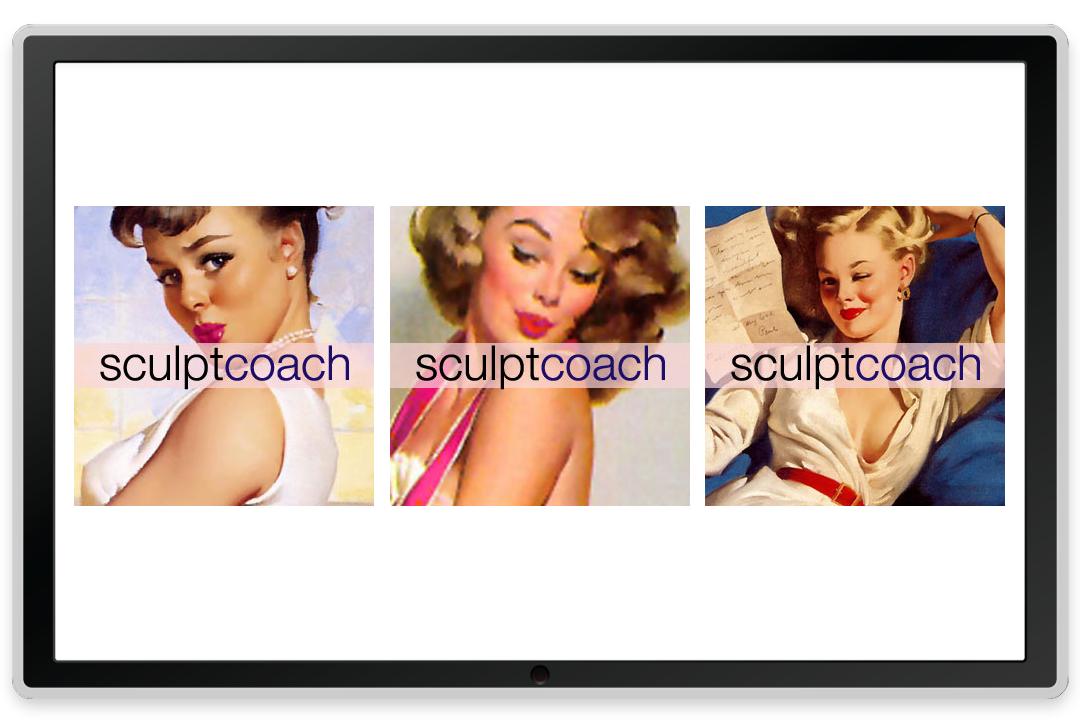
Visuals

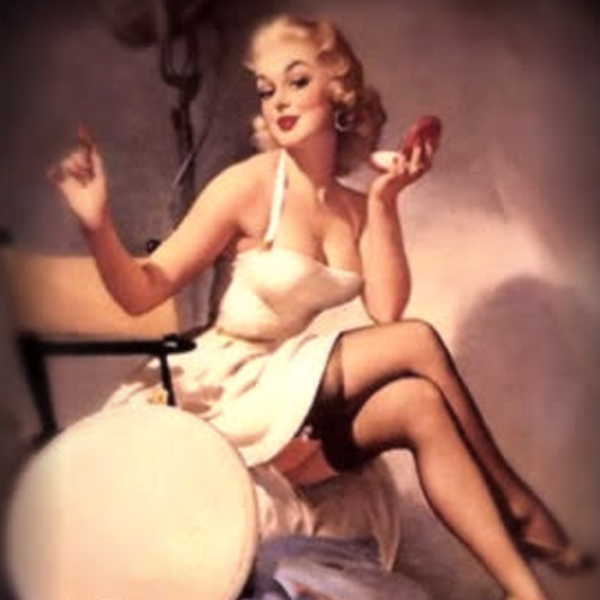
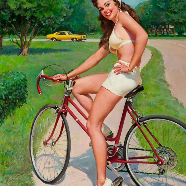
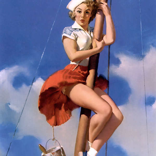
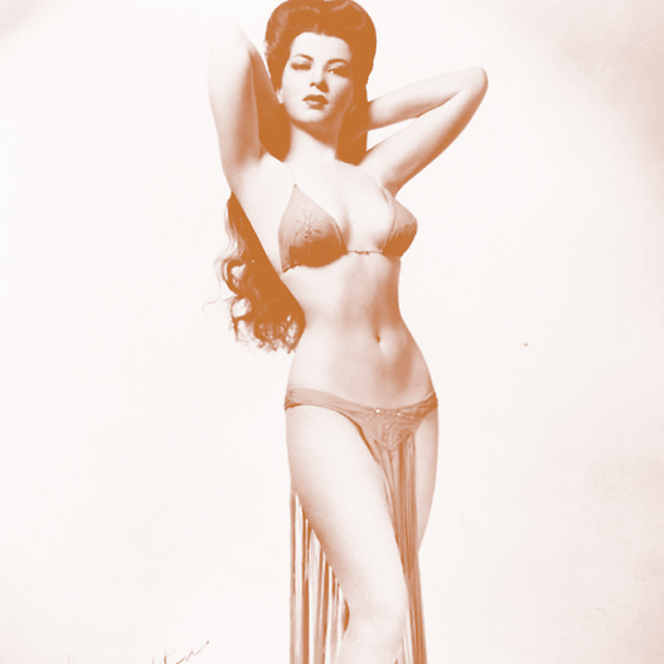
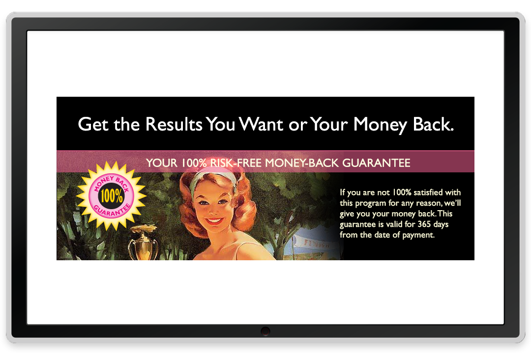
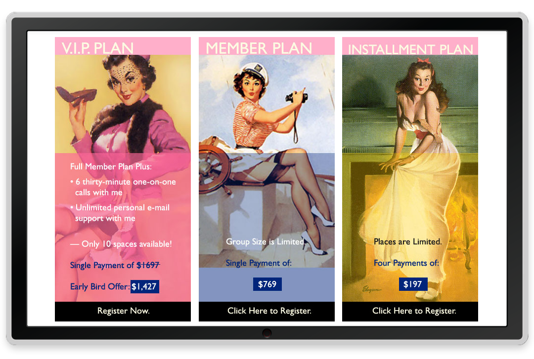
The pinup style art used for this project, both illustrations and vintage photography, were a case of right time right place. We struck a balance conveying a sexy, colorful world that inspired the women it addressed and the way they want to feel. The program creator did her own photo shoot with a nod to the style for publicity. We had a great time with this project.
Website Sales Page
This was a sales page website, meant to drive interest to Tara’s Program. We had a blast with the pinup style branding that fit the client to a T. Her audience adored the approach; it got rave reviews.
Website Sales Funnel
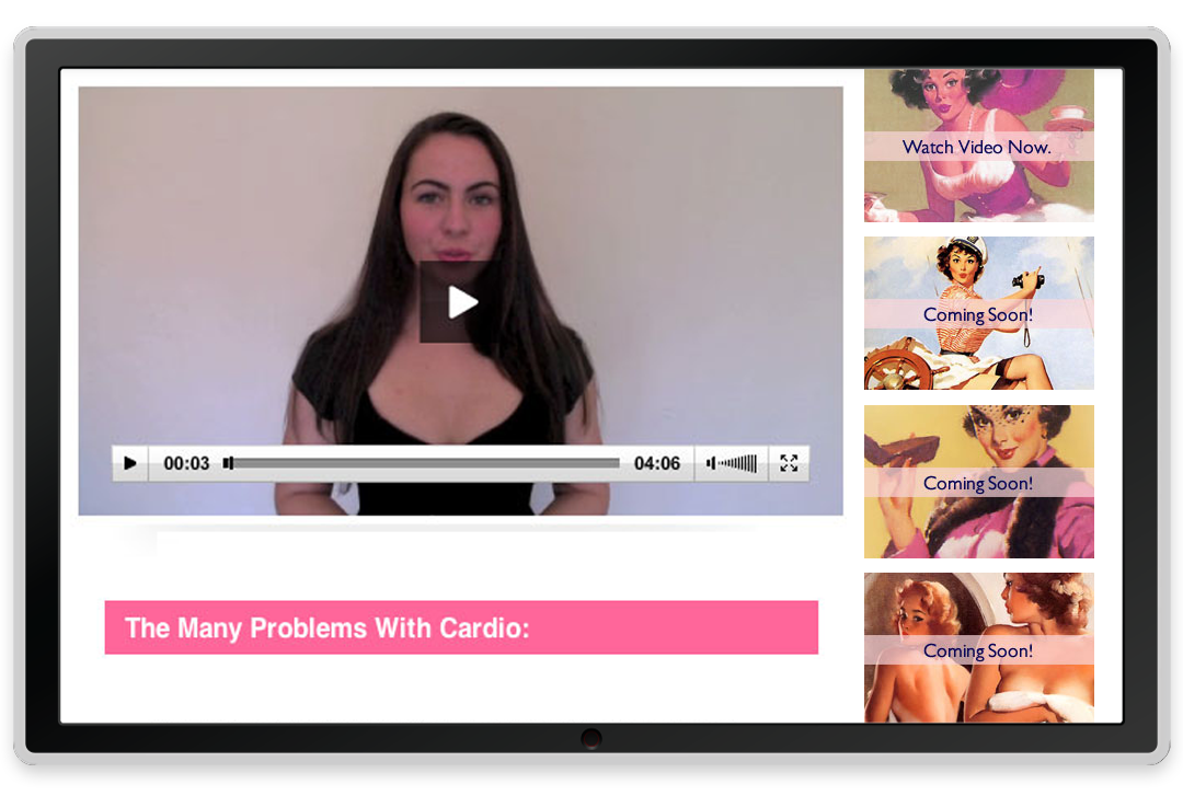
The sales funnel was a classic series of 4 videos leading to the sales letter. Pinup style brand consistent artwork was used throughout the funnel.
Facebook Identity

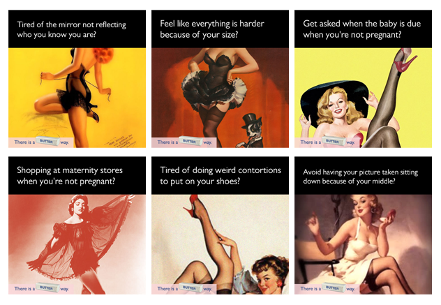
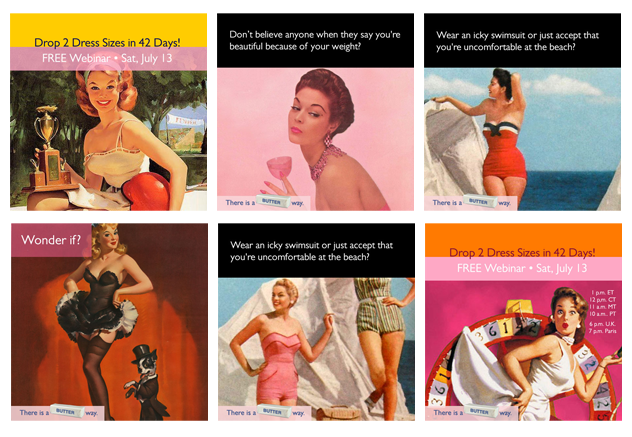
We used Facebook to widely share about the Program — in groups and on pages. The fun artwork made it easy to share. The headlines primarily came from asking women who wanted to lose weight the most frustrating things they felt. Their responses were synopsized into headlines that perfectly captured the real emotions of the program’s audience. We had over 200 responses to pull from.
Stop Treating Your Business Like a Wishing Well
Let's make it work FOR you.
Let's start a great conversation.
About getting you the brand and business of your dreams.
Unsub any time. We never spam.
GET ACQUAINTED
About
Clients
Success Stories
Book a Consult
JOIN THE Community
Based in da Bronx. You got a problem with that?
Designed with love by Katie Colormaiden ![]()