
“Amazing work!…
Thank you so much for your amazing work! I appreciate your creativity every day!”
— Lorelle Cicitta, Forza Fitness
Ocean City, NJ
Updated logo
This was the basic logo in place for Forza when I started work with them, which I cleaned up. The owner has a version tattooed on her so it wasn’t going anywhere soon. They needed to solidify it, however, because they didn’t have the original artwork (this happens). I researched and found the typeface used for the drop cap, recreated the logo and carefully tweaked the thickness of lines so it could be used at all sizes in all different circumstances from small business cards to oversized signage. t-shirts and promotional items. I created a new type treatment for the name when displayed in full, shown below. The typography carries out throughout brand elements.
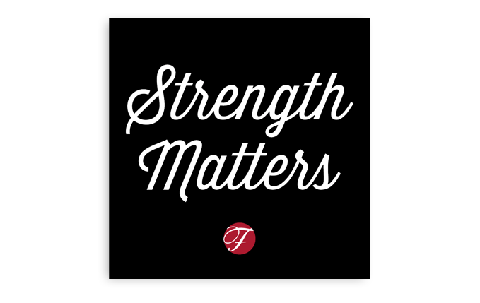
Tagline
The tagline I wrote for Forza, “Strength Matters,” is perfect because Forza means “strength” in Italian and the owner is Italian. Strength is what she’s bringing her customers. It’s also a tongue in cheek pun on the phrase “size matters” but it doesn’t matter if someone realizes that or not for it to work.
Naming system

I created a domain naming convention for this business using a new TLD (top level domain, the extension) of .fit. The main site moved over to Forza.fit and the aerial yoga site uses ForzaFly.fit. The system allows for future growth and easy memorability. .Fit is nice and short, always good for sharing.
Color palette
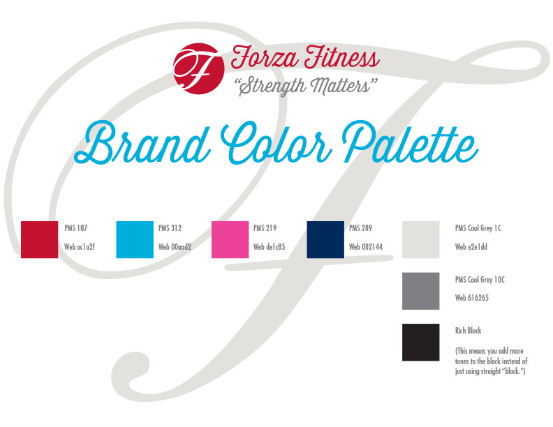
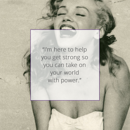
For this brand’s visual style, we stuck to a simple color palette. The vintage imagery played to the owner’s style, perfect for an entrepreneur who represents their own brand. I used black and white with bright red and cyan blue accents, along with warm grey. We used copyright-free images of Marilyn Monroe, who the owner loves, with additional vintage workout shots and successfully mixed in contemporary images of the owner and clients by sticking to the black and white approach.
Typography
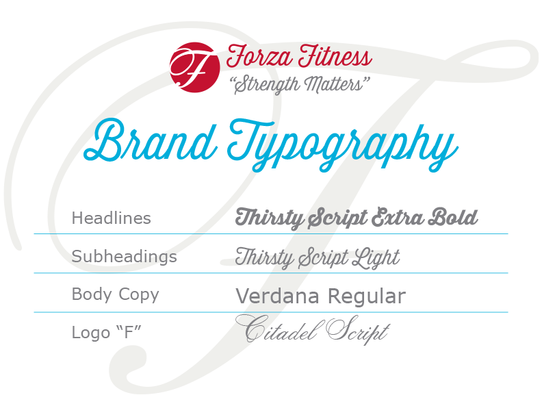
I picked a typeface with a modern vintage feel that works great to bring the look together.
Value proposition statement
Forza is a no-nonsense, get it done approach that still cares deeply about its clients. All the copy reinforces this attitude.
Visuals
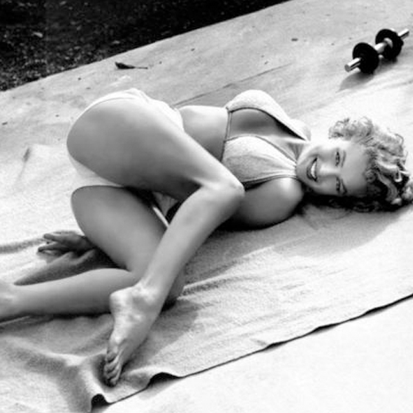
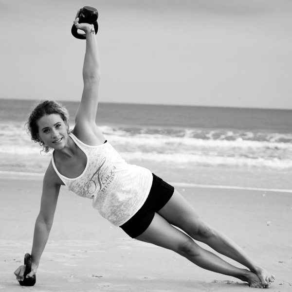
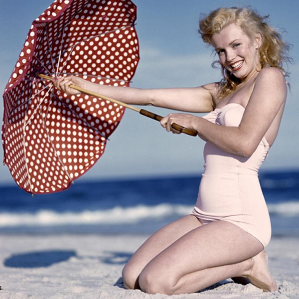
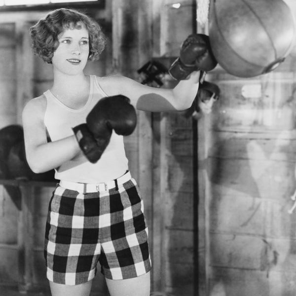
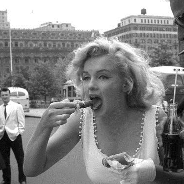
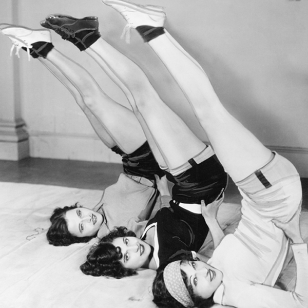
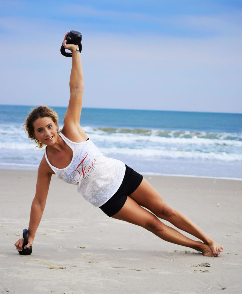
Forza’s owner told me she loves vintage style with a modern twist. That makes me happy because there’s so much I can do to make a vintage approach feel stylish and new. She’s also a big Marilyn Monroe fan so it was a natural to employ copyright-free images working out and on the beach. I mixed in other vintage workout photography and tied in current shots of the studio and clients by sticking to the black and white palette and incorporating branded graphic elements.
Graphics
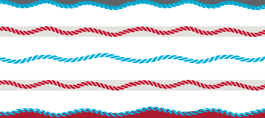
Since Forza is located in a beach town, I brought in a seaside feeling with graphic art elements, such as stylized rope for a border treatment. The owner also told me she loves bows and leopard print; I was able to bring them in sparingly for fun.
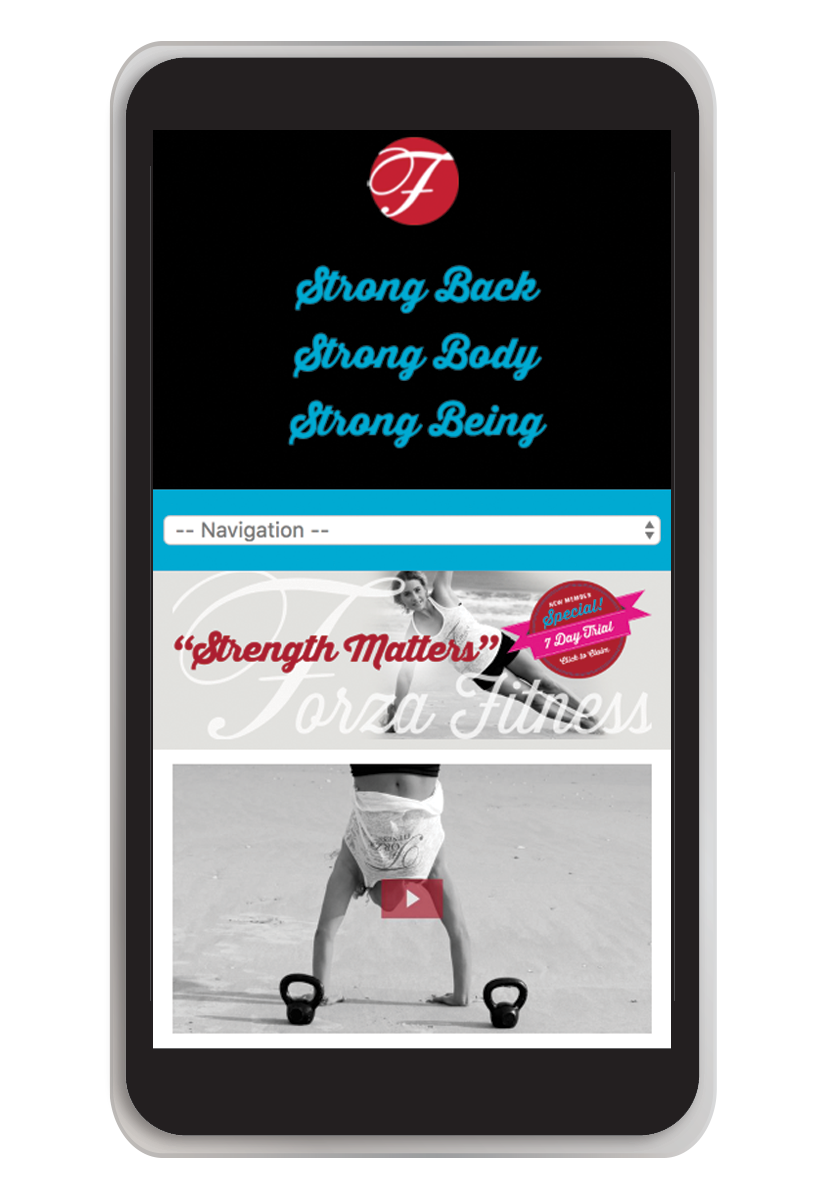
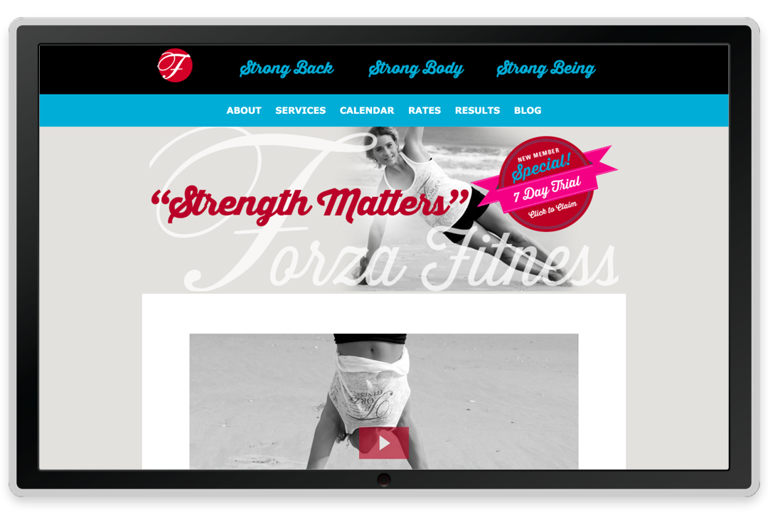

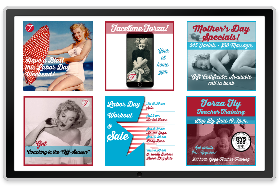
Website
Lorelle needs to create ongoing specials. So I made a section on the home page where she and her team can pop in current weekly or monthly specials. I styled a bunch so they could refer to these for their own.
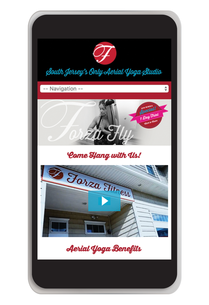
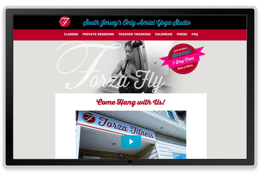
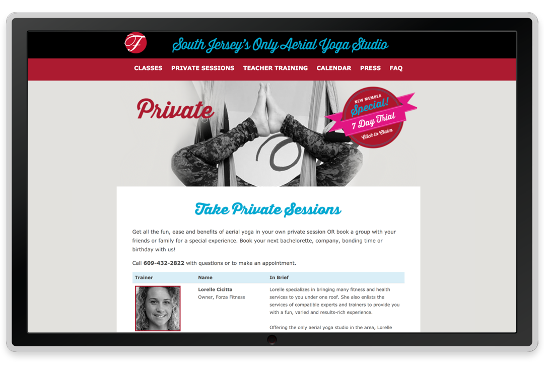
Sister website
I created two separate websites for this brand: one for the main Forza Fitness business and one for the spinoff Forza Fly aerial yoga business. The aerial yoga business gets a lot of specific interest so it’s helpful to be able to direct people right to that domain. It also allows future flexibility if she ever wants to syphon off that piece of the business.
Opt-in offers

I worked with the owner to conceive of opt-ins to bring people into her mailing list and to attract clients. I created the artwork that shows up throughout the websites to opt-in to her list(s).
Business card
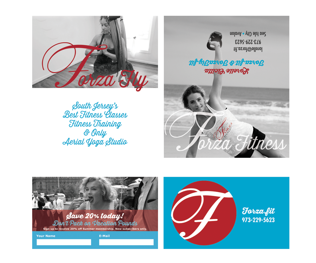
This is a fold-out business card, shown here opened up. Top shows the front and inside spread. Beneath is a two-sided insert. I put the aerial yoga business, Forza Fly, on the inside spread. The insert has contact info in case it gets separated from the main card. The insert can be reprinted to feature a different special or opt-in.
Magnets
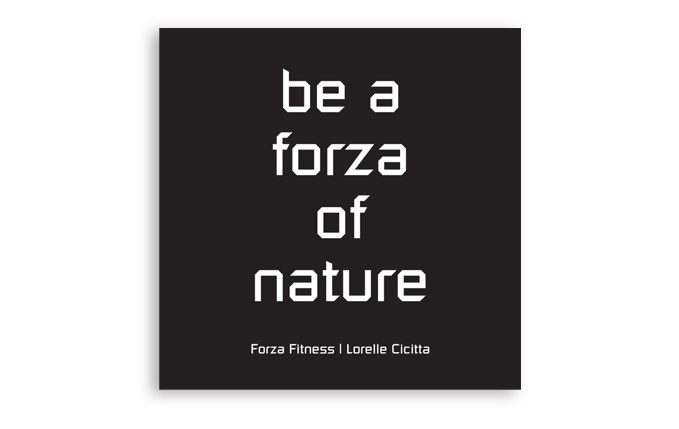
The lefthand magnet is a gift I gave the owner for Christmas when we were starting work. The righthand one is another we made after the brand was defined.
T-shirts
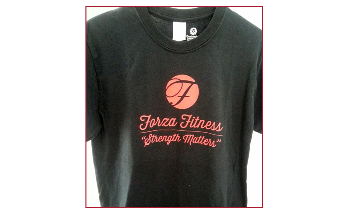
Branded t-shirts and tank tops sell online, furthering brand loyalty.
E-mail
opt-ins

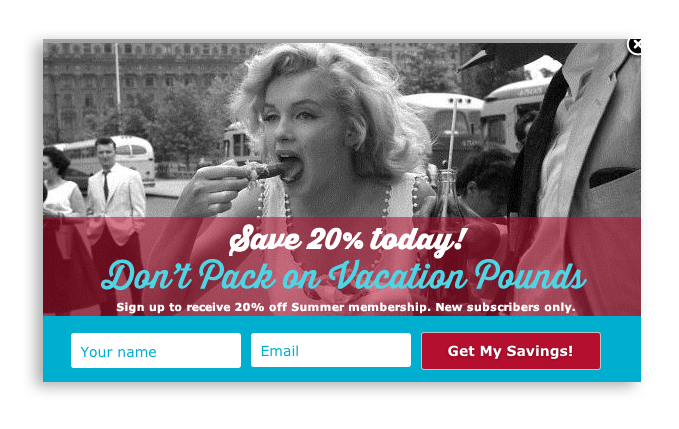
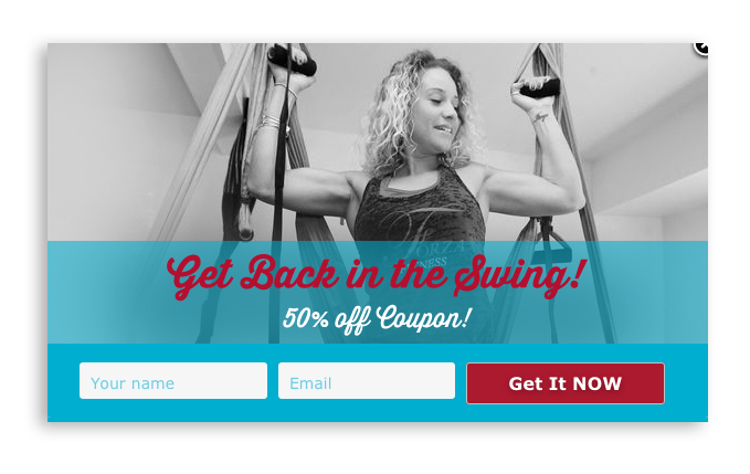
These fun lightbox popups are created using PopupAllyPro (I’m an affiliate), the world’s first “polite popup,” so-called because it can detect if a visitor has been on the site previously and you can set many details such as the timing, individual pages, exit intent and more.
Signage
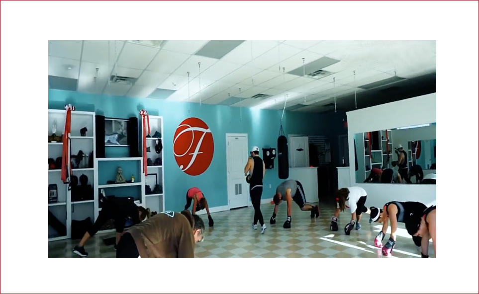
The owner wanted wall art and didn’t have the budget for a sign installation and fabrication company. I created an oversized decal shown here on the gym’s back wall center. You have to install this yourself and there are seams but it works great for a fraction of the cost of a signmaker. We used the same approach for reception desk wall signage.
Stop Treating Your Business Like a Wishing Well
Let's make it work FOR you.
Let's start a great conversation.
About getting you the brand and business of your dreams.
Unsub any time. We never spam.
GET ACQUAINTED
About
Clients
Success Stories
Book a Consult
JOIN THE Community
Based in da Bronx. You got a problem with that?
Designed with love by Katie Colormaiden ![]()