“My website generates income…
The website looks AMAZING! My website Katie created captures interest and generates income. Very few people can actually say that. And I can quantify it.”
— Dr. Michael Major
Verve Orthodontics
St. Albert, Canada
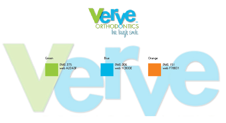
Color Palette
Verve’s logo was in place before I was initially brought in to create a series of ads (see examples below). During the course of working together, I added orange as an accent color to the palette and moved the original brand direction forward as shown in this overview.
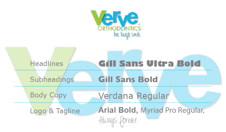
Typography
I established typographic treatments for advertising and materials. Gill Sans added a bit of whimsy without clashing with the logotype’s Arial and Myriad faces. The tagline is handwritten font Always Forever. Introducing another handwriting style would mean too many different directions. Gill Sans’ simplicity works with all the faces without being distracting and still adds punch when used in headlines.
Vision Statement
The business’ “Primary Statement” is the result of the Vision process I take clients through. This succinct statement forms the basis of the entire brand concept. Not to be confused with a tagline, its role is essential in setting the tone of everything else.
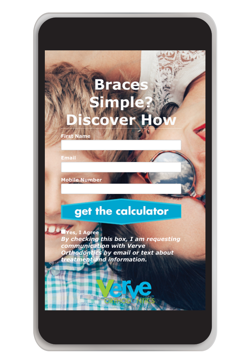
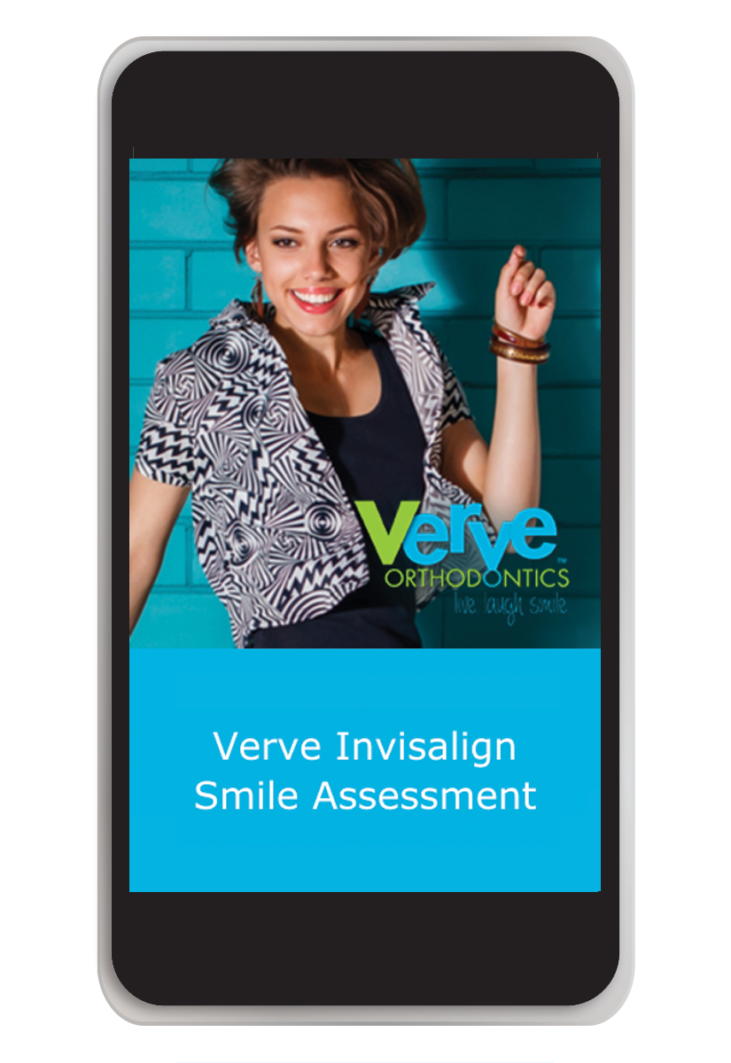
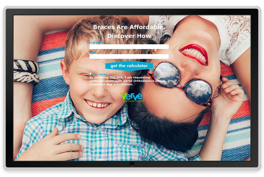
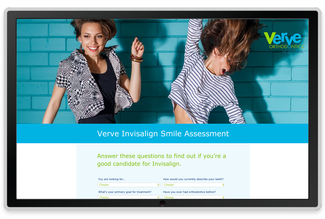
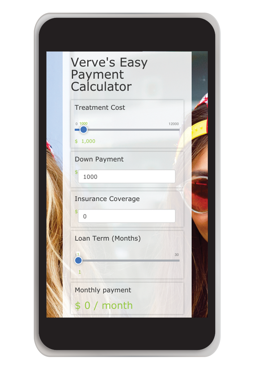
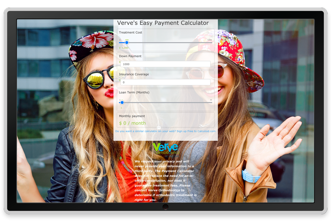
Opt-In Landing Pages
I created several landing pages for the individual “opt-ins” throughout the website. These include a Payment Calculator, an Invisalign Assessment, a Patient Guide and a Book a Consult page.
Freebies
Rewards once people have opted in.
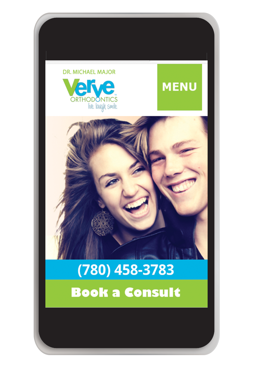
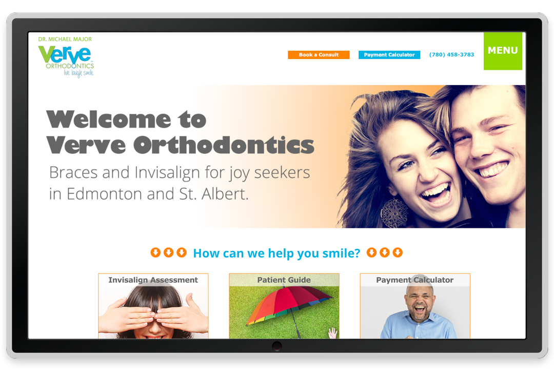
Website
Verve’s new website I designed was built primarily for function. Our focus is largely on user experience. This client wanted to use the site to bring in business as opposed to simply sharing information while looking inviting. We worked to ensure people would be guided to come meet with Dr. Major. A lot of back-end work was put into our CRM (client relationship management) system. This allows us to track responses and add automation to the follow up process.
Patient Guide
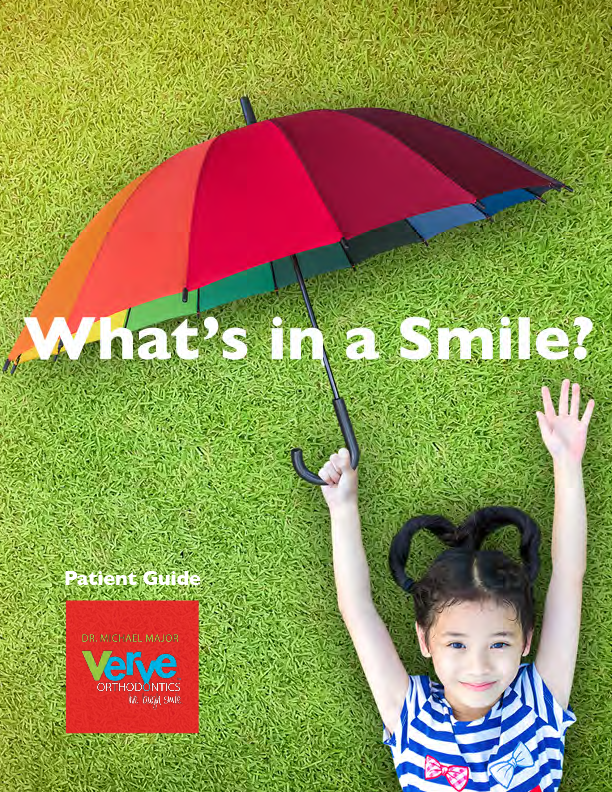
I designed a simple, branded “Patient Guide” for new clients.
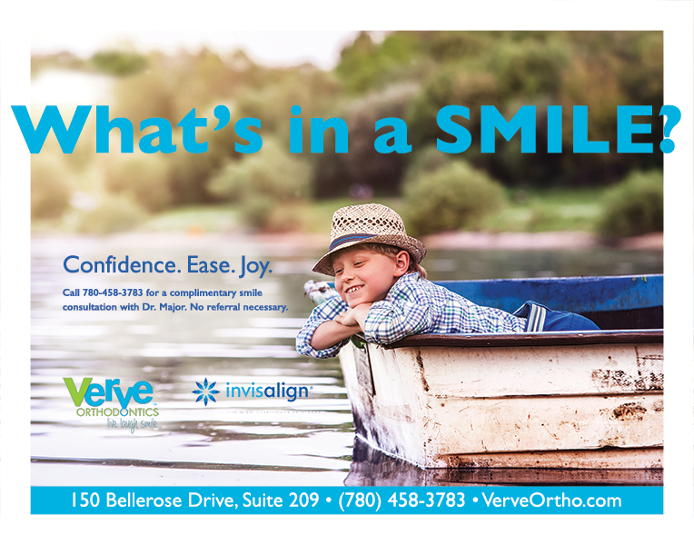
Print Ads
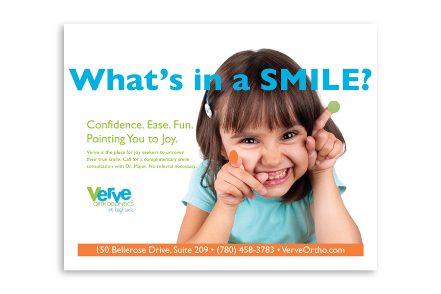
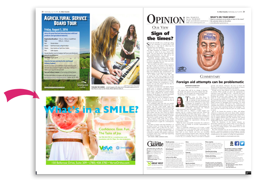

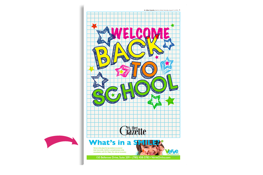
I designed a series of newspaper ads run during the back to school season that brought in many new appointments and clients. I wrote the headline “What’s in a Smile” in keeping with the focus on your smile coming from within.
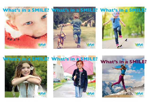
Online Ads
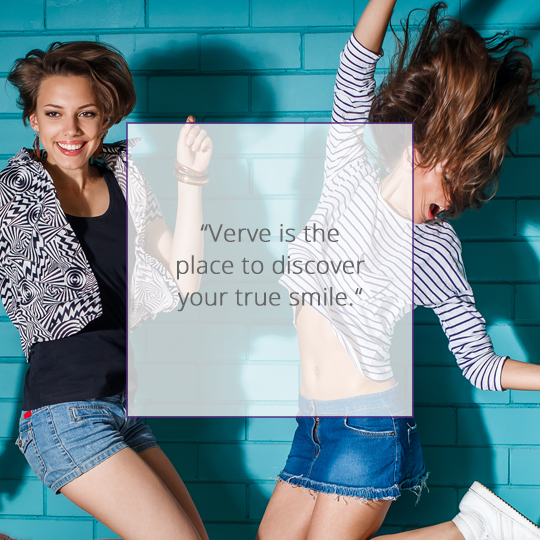
We also ran Facebook online ads to the various opt-in offers. It’s important to make online ads not look too sales-y. Even if the artwork matches print ads, the approach is importantly different for realizing the results you want.
Facebook Identity
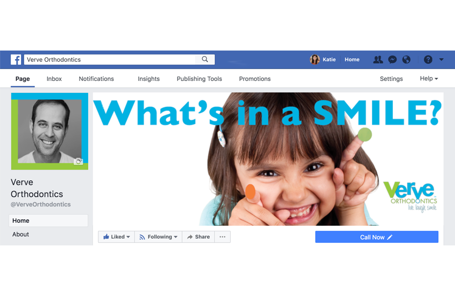
Verve’s Facebook business page was updated to reflect the new brand identity. I designed dozens of branded posts expressing the joy of this brand.
Stop Treating Your Business Like a Wishing Well
Let's make it work FOR you.
Let's start a great conversation.
About getting you the brand and business of your dreams.
Unsub any time. We never spam.
GET ACQUAINTED
About
Clients
Success Stories
Book a Consult
JOIN THE Community
Based in da Bronx. You got a problem with that?
Designed with love by Katie Colormaiden ![]()