Name & Logo
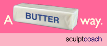
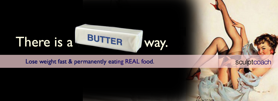
I came up with the name “A Butter Way” for this healthy eating and weight loss coach when she told me that a big part of her program was advocating eating real butter. Bingo. Home run. We used the domain name also. The artwork I created shows the traditional stick of butter to emphasize the point. The style of illustrative (with some vintage styled photography also) pinup art was perfectly suited for the program leader’s fun, feminine style. It hugely appealed to her audience.
Primary Statement
I use the term “Primary Statement” to describe a simple, clear statement describing a business / program. In this case, “Lose weight fast and permanently eating REAL food.” This is importantly different from a tagline, which can at times say nothing about the actual business and is intended to create a mood and feeling. The Primary Statement is intended for one thing: clarity.
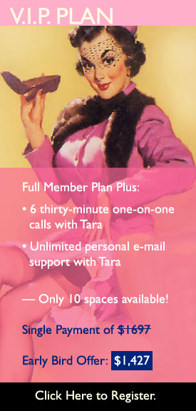
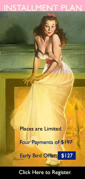
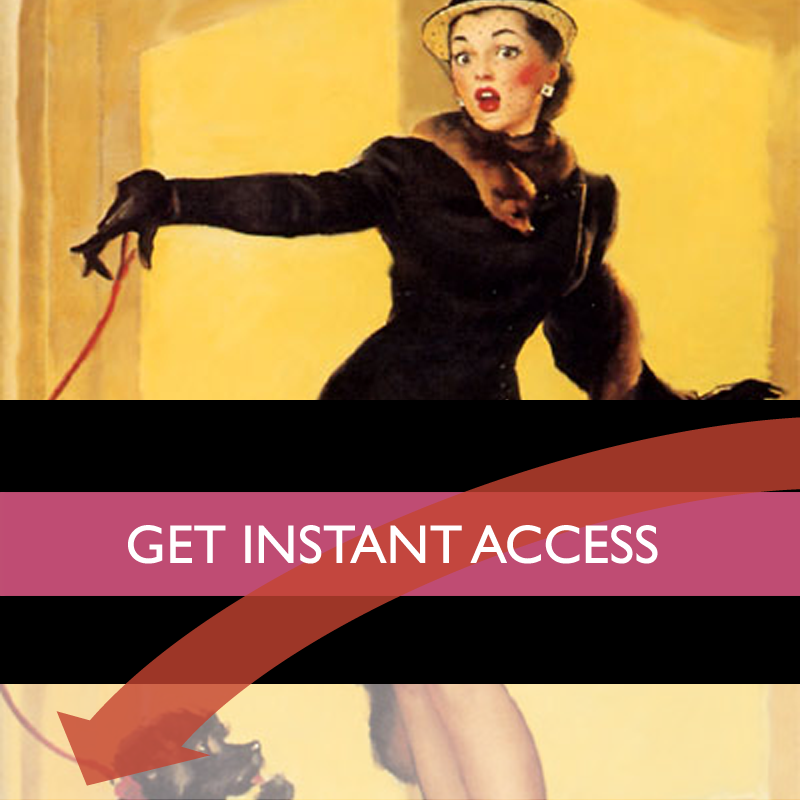
Sales Page Site
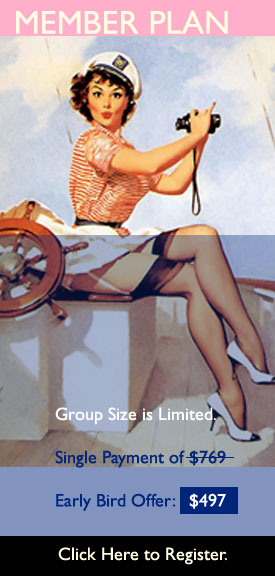
I designed, copy edited and did all the technology setup for the program’s sales page site. We used video in the sales funnel sequence. Artwork was on brand throughout, in all details.